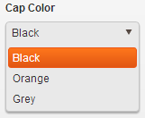
Telerik's Kendo UI Web makes a spiffy looking drop down with JavaScript and CSS.

The demos on the Telerik site show drop downs with default widths and not much text.
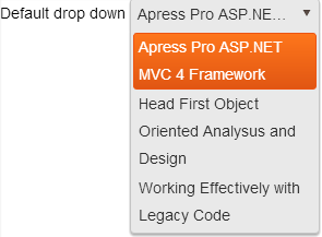
That breaks down when the text in the drop down gets longer because it wraps. I don't like this look.

So I wrote a JavaScript function that resizes the drop down to fit the width of the data so you avoid the wrapping and get:

Here's the JavaScript:
var resizeDropDown = function (e) {
    var $dropDown = $(e.sender.element),
        dataWidth = $dropDown.data("kendoDropDownList").list.width(),
        listWidth = dataWidth + 20,
        containerWidth = listWidth + 6;

    // Set widths to the new values
    $dropDown.data("kendoDropDownList").list.width(listWidth);
    $dropDown.closest(".k-widget").width(containerWidth);
}
You have to call this on the drop down's dataBound event. That way, if you're pulling remote data through something like Web API, you won't resize until you've gotten the data back and fired the dataBound event.
Here's a JSFiddle to play around with it. The fiddle shows two drop downs – one with the default sizing and wrapping, and the other with the resizeDropDown function called on the dataBound event.