I wanted to try out the new mobile features of ASP.NET MVC 4 to convert an existing site (this one!) to a half-decent looking iPhone/iPad app. It was really easy. Here are the steps and what I learned in the process.
Think about what your mobile user will want to do
This is the most important piece, and it's one you need to take seriously before you dive in. If you skip it, you'll just have a mess. You know that tablets and phones are smaller, so things that require lots of screen space won't work. But what is the main thing people open the site/app to do? Optimize for that and put it front and center. If there is more than one thing your site/app does, how will mobile user's navigate around? When converting an existing app to mobile, you'll probably want to cut out a lot of extraneous stuff. You could also phase in different chunks. It doesn't have to be all or nothing.
Choose your technical approach
Scott Hanselman has a nice blog post and chart showing effort compared to user experience across different approaches to making your app mobile.
He covers responsive design (CSS media queries and resizing), using a mobile framework (like jQuery Mobile), or going native (Objective-C). My only quibble with the Scott's chart is the green circle for native apps is too small. I think that's WAAAAY more effort.
For this post, I went with a mobile framework (jQuery Mobile). This is the most bang for your buck. You can learn it in less than an hour, and convert views and layouts in a half day to a day, depending on how complicated your views are.
Get jQuery Mobile
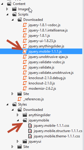
Add the jQuery Mobile NuGet package to your web project.

It will add the JavaScript, CSS, and sprite icon images in the /Scripts, /Content, and /Content/Images folders in your web project. I moved the JavaScript and CSS to /Content/Scripts/Downloaded and /Content/Styles/Downloaded folders. I prefer to do this so I can bundle scripts with wildcards like /Content/Scripts/Site/*.js. Here's my folder structure:
Bundling
I dropped the *.min.js and *.min.css files since I'm combining and minifying these with the BundleConfig like this:
using System.Web.Optimization;

namespace App_Start
{
    public class BundleConfig
    {
        public static void RegisterBundles(BundleCollection bundles)
        {
            // Scripts

            bundles.Add(new ScriptBundle("~/Content/Scripts/modernizr").Include(
                "~/Content/Scripts/Downloaded/modernizr-2.6.2.js"));

            bundles.Add(new ScriptBundle("~/Content/Scripts/all").Include(
                "~/Content/Scripts/Downloaded/jquery-1.8.1.js",
                "~/Content/Scripts/Downloaded/jquery.unobtrusive-ajax.js",
                "~/Content/Scripts/Downloaded/jquery.validate.js",
                "~/Content/Scripts/Downloaded/jquery.validate.unobtrusive.js",
                "~/Content/Scripts/Site/*.js"));

            bundles.Add(new ScriptBundle("~/Content/Scripts/mobileall").Include(
                "~/Content/Scripts/Downloaded/jquery-1.8.1.js",
                "~/Content/Scripts/Downloaded/jquery.mobile-1.1.1.js"));

            // Styles

            bundles.Add(new StyleBundle("~/Content/Styles/all").Include(
                "~/Content/Styles/Site/Site.css"));

            bundles.Add(new StyleBundle("~/Content/Styles/mobileall").Include(
                "~/Content/Styles/Downloaded/jquerymobile/*.css",
                "~/Content/Styles/Site/Mobile.css"));
        }
    }
}
The bundles created here are for the JavaScript and CSS for the desktop site ("all") and the mobile site ("mobileall"). The "modernizr" bundle is separate because it only works in the <head> section, but the rest is loaded at the bottom of the <body> tag in the Layout view so it doesn't block page loading.
Make a _Layout.Mobile.cshtml
You'll want a mobile layout view. It's probably simplest to take your existing _Layout.cshtml, copy/paste, and rename it to _Layout.Mobile.cshtml.
The view engine routes "mobile" requests to the correct place. I have mobile in quotes here because it puts iPads in that category. Seems like it would be either _Layout.Tablet.cshtml or _Layout.Phone.cshtml instead of _Layout.Mobile.cshtml, since those are very different form factors, but that's what you get out of the box.
If you don't like that, you can add specific views for specific devices with display modes. I recommend looking through your web logs to see what your users are really browsing with so you spend your time making your app look its best for the most popular user agents. Start with a generic mobile layout and go from there if it starts to break down and you're getting enough traffic from that device to warrant the extra work.
You'll probably rip out pieces of your app/site in the mobile layout. Some stuff doesn't make sense on a phone, so this is where you can take it out if it's site wide. If it's something in a view you want to hide, see below.
For the JavaScript, you can probably get away with just jQuery and jQuery Mobile. You probably won't need Modernizr. You may have some site-specific JavaScript you need to include in their, too.
For style sheets, I recommend starting with just the jQuery Mobile CSS. You can add your own Mobile.css (you can rename this to anything you like) referenced in your mobile layout for tweaks and overrides you need to do. I'd leave the jQuery Mobile CSS as-is so you can upgrade later without problems.
You'll also want to set your viewport to max width for every device:
<meta name="viewport" content="width=device-width">
Here's my _Layout.Mobile.cshtml (the relevant parts anyway):
<!DOCTYPE html>
<html lang="en">
<head>
<meta charset="utf-8" />
<meta name="viewport" content="width=device-width">
<title>@ViewBag.Title</title>
@Styles.Render("~/Content/Styles/mobileall")
</head>
<body>
<div data-role="page" data-theme="c">
<header data-role="header">
<div>
<a href="@Url.Action("Index", "Home")">
<img src="@Url.Content("~/Content/Images/Logos/Logo_100px_High.png")" alt="Volare Systems, Inc." width="160px" height="100px" />
</a>
</div>
</header>
<section id="content" data-role="content">
@RenderBody()
</section>
<footer>
<nav>
<ul data-role="listview" data-content-theme="c" data-divider-theme="d" data-inset="true" >
<li data-role="list-divider">What We Do</li>
<li>@Html.ActionLink("Home", "Index", "Home")</li>
<li>@Html.ActionLink("Services", "Index", "Services")</li>
<li>@Html.ActionLink("Customer testimonials", "CustomerTestimonials", "Services")</li>
...
</ul>
</nav>
<div id="copyright">
&copy; 2009 - @DateTime.Now.Year.ToString() @Html.ActionLink("Volare Systems, Inc.", "Index", "Home")
</div>
</footer>
</div>
@Scripts.Render("~/Content/Scripts/mobileall")
</body>
</html>
Start using jQuery Mobile
Now it's time to start adding in the data-* attributes and classes jQuery Mobile wants to use. You'll find them here on the demo site. I used:
- data-page="page" in the mobile layout as an outer wrapper
- data-theme="c" (try out the different themes to see what suits you best by swapping out letters a-e)
- data-role="content" around the
@RenderBodymarkup - data-role="listview" and data-role="list-divider" for the navigation
- data-role="collapsible-set" and data-role="collapsible" for collapsible text that shows/hides when you click it
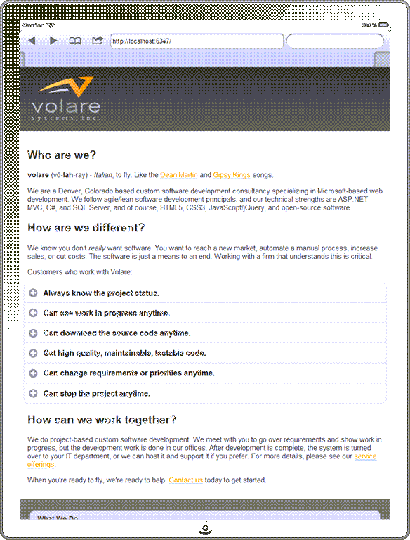
Here are the results:

Click through the docs and see what you can find that adapts well to your situation. For forms, I found it was fine to remove my normal style sheet and let jQuery Mobile take over.
Make a Mobile.css
I use Site.css and Mobile.css as my desktop and tablet/phone CSS files. The _Layout.Mobile.cshtml references to the Mobile.css, and _Layout.cshtml references the Site.css.
You may not need a Mobile.css, but I found it useful to tweak margins, padding, etc. to get the look I wanted. You'll probably have to use the !important CSS tag to force your CSS to override the jQuery Mobile CSS, so watch out for that. Also, every time you do this, someone at A List Apart sighs heavily.
Test and tweak your views
There are lots of cheap and free iPhone/iPad simulators out there. Try to find a free one you like. I gave up and downloaded the Electric Plum one. So far, so good. It's more stable than the free ones I tried.
Once you browse to your site on localhost, you'll see things you didn't realize would be such a fail on the phone. This is your chance to remove it or fix it. There are several approaches I used, based on the situation:
- Add jQuery Mobile
data-*attributes to your view to render it the jQuery Mobile way. Sprinkling these should not collide with your HTML for desktop rendering. - Change the
Mobile.cssto draw the elements a little differently just for mobile. If it's really minor, you can hide it with a CSSdisplay: none;, but keep in mind this will run on a phone. If you have the chance to send fewer bytes from the server to the device, that's almost always going to be the way to go. - Add server-side conditional checks for code or markup that is only for mobile (or just for desktop). In a MVC Razor view, this looks like:
@if (Request.Browser.IsMobile) {
    // do something just for mobile
}
- If the conditional branching inside your view get to be too ugly, you can add a mobile-only view with the same naming pattern. So
Index.cshtmlhas a mobile cohort inIndex.Mobile.cshtml. You can break common code between the two views into partial views, and have the mobile and non-mobile views reference those partial views with the normal
@Html.Partial("_ThePartialView")